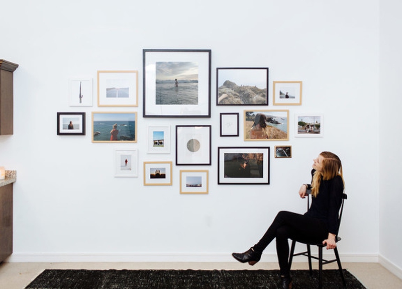
A big wall can be beautiful, but it can also be an eyesore. You can fill that wall with art prints, small framed photos or a painting, but I am drawn to the designs that choose the unexpected — designs that use repetition of everyday items to make a statement. I am all for the designs that live boldly.

Part 1
You might not be an antlers kind of guy or gal, but these longhorn skulls look fantastic in this space. If there were only one skull, there would still be too much white space on this large entry wall. The addition of a second horn rack is beautiful and, together with the bench, creates a pleasing grouping of three.
If you aren't an artist and you don't have a lot of money to buy art or sculpture, you can use structural items in new ways. As a twist on the classic leaning floor mirror, this bamboo structure gives depth to this space without becoming a distraction.
Now imagine the springs of a twin bed or crib spray-painted bright orange and leaned against the wall.
Often the blank spaces on our walls are small and show a lack of balance. In this space, the dark piano is very heavy and, without artwork, the open white wall space could look off-balance. The solution? Add an unorthodox sculpture of twisted wire, painted scribbles or another bold choice.
Take this same trick to another side of your space to show continuity. Change it up by altering the shape of your art and by using repetition to fill the cutout space.
Repetition is always your friend when trying to fill a blank wall cohesively. This simple grid of small frames is a classic way to offer large-scale interest for less money. Try painting all your frames an interesting color, covering them in gold leaf or using a range of shades from top to bottom. Frame anything and everything from black and white photos or pages ripped from a 1970s lingerie sewing book to vintage patterns or sheet music. The possibilities are endless!
Holiday designs don't have to be frilly. Simple, graphic snowflakes fill this plain white wall with the sights of the season.
Using fabric panels trimmed out in molding is a great way to give a wall interest in a classic space. In a more modern space, you could choose a punchier color, or perhaps a graphic, comic-book pattern. Try this trick with thick bed sheets off the clearance rack instead of purchased fabric off the bolt and you'll save even more.
At first you might not think you are an artist, but you will be surprised what you can come up with after some practice. Find a large, pre-stretched canvas at a thrift store, buy Oops paint from your local hardware store and experiment with different brush strokes. You might come up with a modern masterpiece.

View All Comments /Add Comment